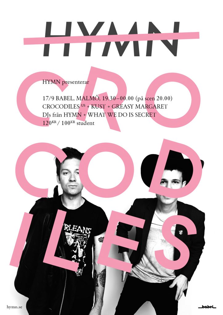
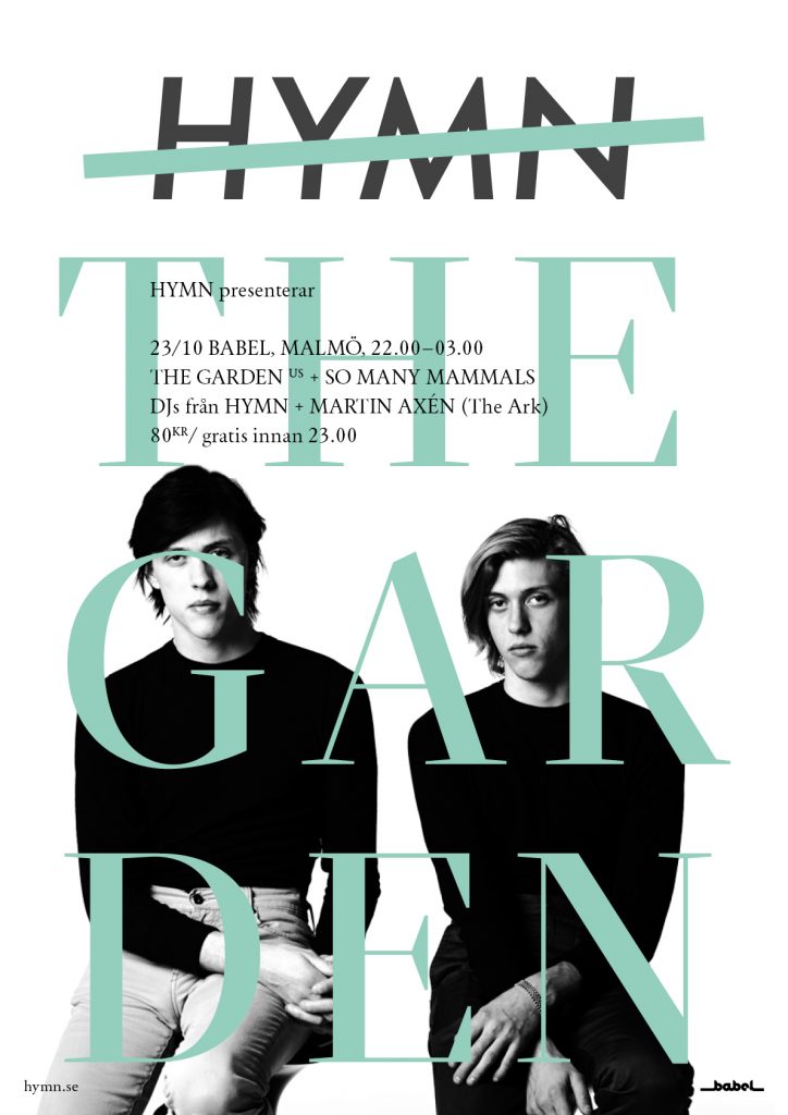
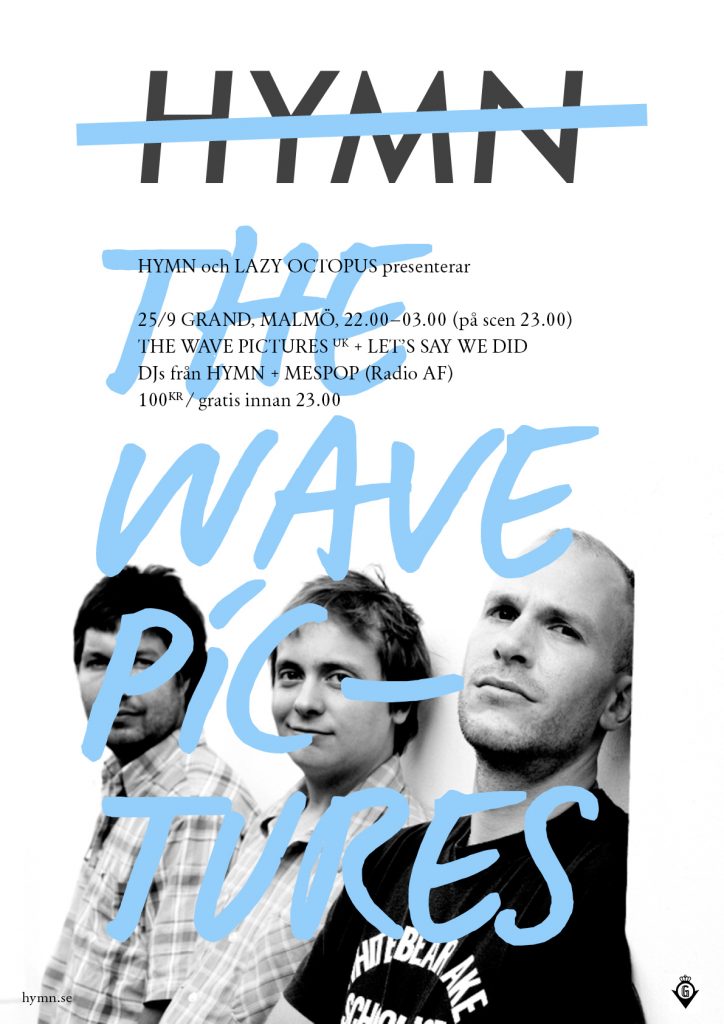
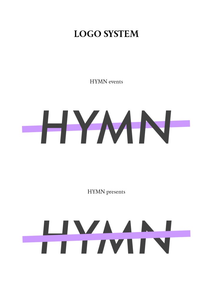
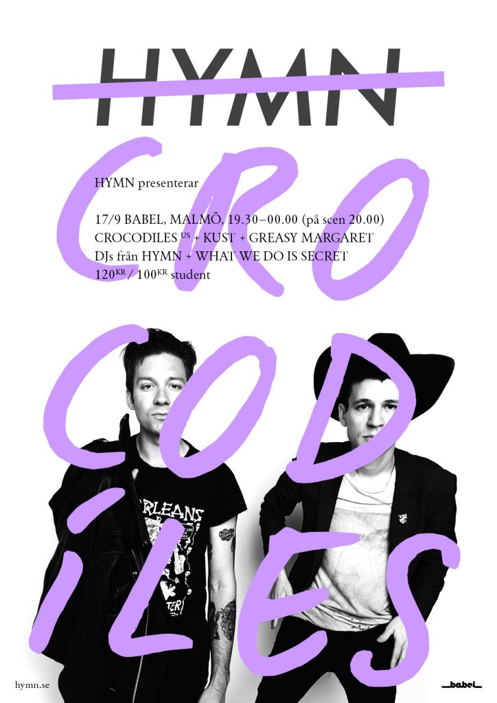
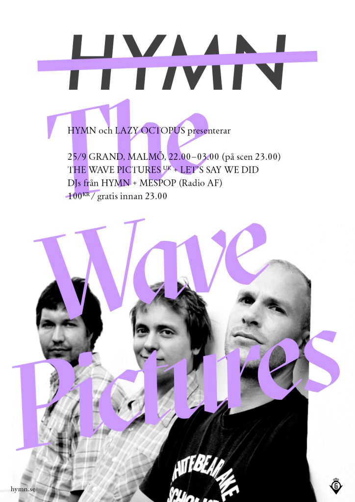
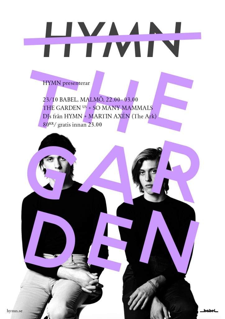
During the summer I’ve been working on extending the visual identity for Hymn, which is now one of Sweden’s biggest online magazines for new music. The identity has been broadened to include co-branding, or events presented by Hymn. That could e.g. be a concert where the band takes prominence over the brand. Eventually, the plan is to introduce further colours into the palette. The concept is designed to handle unique band logos or layouts using varying fonts – shown here are Sectra and Haptik Rotalic from Grilli Type, as well as Playtype’s good old Signature. The stroke becomes an active element, shown in the slide below.
The basic design relies on monochrome photos with burnt out backgrounds.
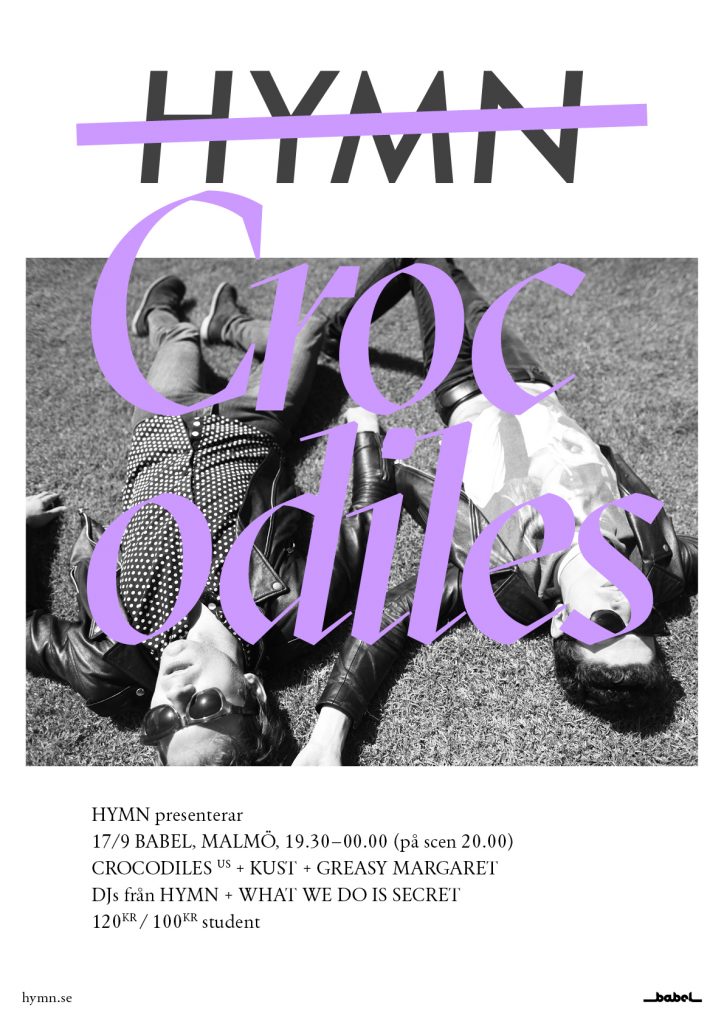
In cases where suitable images cannot be found, the follow layout should be used.

Suggestions for three new secondary colours.