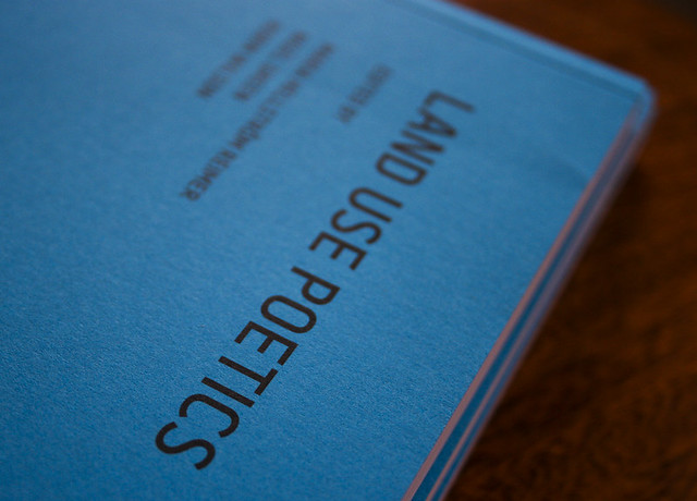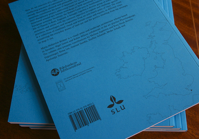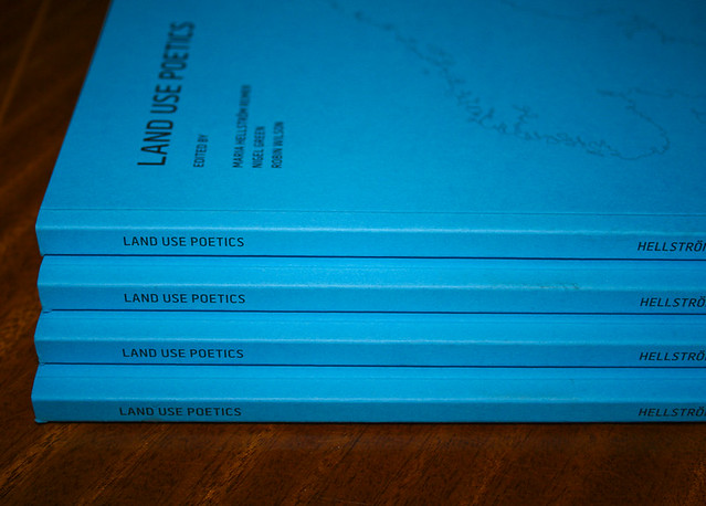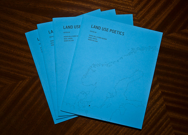
You may remember me mentioning I was working on a book for the international Land Use Poetics project. Well, the books have just arrived from Printografen now, and here’s what they look like. The font you see on the cover here is Battersea 2010, designed by London studio A2/SW/HK and available from Playtype’s store. The book utilises QR codes to link to time-based media on their website. See below for additional photos, click on them for full size Flickr links.